Two Photographs, One Picture

I appreciate that my photographs are very different to what the majority of people would consider makes a good photograph of the Tower of London, for this I make no excuses. In a lecture recently I was asked by a student about my relationship to the audience/viewers of my photographs. My answer was simple – when I’m making a body of images I give the audience no thought what so ever. I added that I thought that as soon as you start thinking about how your photographs will be received you are on the road to making formulaic photographs of no worth.

With this said (and the final prints well under way) I would like to try and explain what i see in a particular image and why I chose it over a seemingly similar photograph. Next week I will also post my inrodution to the final piece, which will explain my collected thoughts on the residency and the photographs I have produced.

I like to quote other writers on the subject, because they can put it into words better than I can and it also comforts me to know that I am not alone in the way I think about photographs.

‘For me, the best photographs always inspire curiosity rather than satisfy it. I think this ambiguity is one of the most thrilling aspects of the medium. A photograph is only a minute fragment of an experience, but quite a precise and telling fragment’

– Aaron Schuman (in conversation with Alec Soth)

table-in-salt2

table-edge6

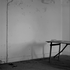
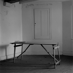
So, here we have two photographs of almost the same area of a room in the upper Salt Tower, both photographs were made on the same visit, but the lower image was a re-shoot of an image I had made on an earlier visit (which could not be used due to a problem with the negative). I re-shot the lower photograph and decided that while I was there I would try a different framing with the complete table in shot.

I can’t remember my exact thoughts when framing up the lower image (I tend to work intuitvely) but I remember liking the line of the cable on the left hand side and the way that it balanced with the line of the rooms corner on the right hand side. I can now see the odd way the corner walls meet at an angle greater than 90 degrees and that this creates a strange perspective. Add to this the way that the table juts into the image offering only a piece of bubble wrap on its dusty surface and the picture begins to feel expectant, it gains a kind of empty wieght; I find this hard to explain but this is something I come to look for in my pictures, what the poet Rilke (when talking about the objects in his Object Poems) described as the ‘silence of their concentrated reality’.

Almost in the center of the image is the tables shadow which seems to drop off, over the edge of the floor, and in the bottom left we have some leaves lying at the run off point of the line of the floor. The small triangle created by the cable on the wall in the top left of the picture is mirrored by the triangle of the table legs in the lower right. This may seem like a strange framing but the more I look at it the more I like its illusion of awkwardness which hides a certain balance. Compare it to the image where the table is in full view: this image lacks any mystery, or oddness and it also lacks balance.
The Final, Final Edit

The final edit is now done and all the negs are at the printers, the point of no return as it were. As it stands the final show will be made up of 15 photographs. There will also be a limited edition boxed set of 6 images, which meant I had to do a further edit of the 15 images down to 6 images for this. This was a lot easier than I expected, the 6 images took on a feel of their own that exists separatly from the main show. I actually changed my mind about one image while at Robin Bell’s darkroom.

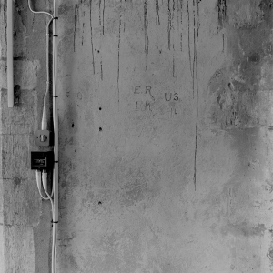
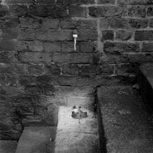
I’m not going to post the whole series of 15 images on the blog but I thought I would put a few pictures from the selection to give you an idea.

salttowerwall

leafunderpipe

table-edge

This last image is one that i am uncertain of, I dont mean that I’m unsure of its place in the final edit but more that I am unsure why I like it. I think I have spoken about these sorts of images in the past, the way that most of my favourite photographs (be they by me or other photographers) are ones that I don’t really know why I am drawn to them. These sorts of pictures hold my attention longer than more immediate images, because they make me come back and look again and again. A photograph I took almost 10 years ago still has a similar effect on me now (below).

image003

Alec Soth

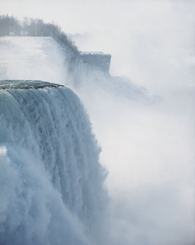
Magnum photographer Alec Soth first came to prominence with Sleeping by the Mississippi (2004) in which he followed said river with camera and took photos on his way.  The resulting images hint at stories but together create a poetic collection verging on a constructed folklore.  However, it Soth’s NIAGARA (2006) that attracts my interest in this post because of the way Soth approached one of North America’s most cliche’d tourist sites.

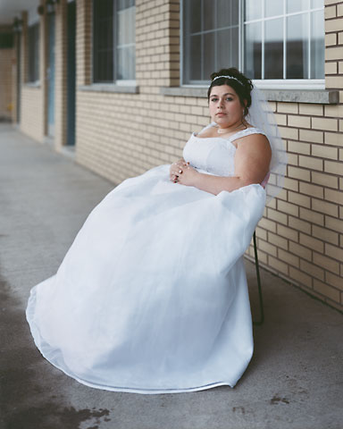
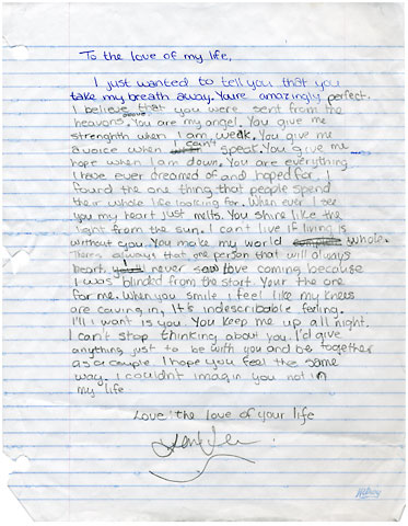
Those that have been to Niagara Falls could not fail to be impressed by their natural beauty and immense power which is why it first developed into a tourist site, particularly in the late 19th century when it was advertised as a honeymoon site by the New York Central Railroad.  Its development as a tourist site has fallen into every cliche since then as fun parks, fireworks and neon lights abound, but fundamentally it remains a site that still arouses and reflects romantic urges and passions.  Soth’s NIAGARA took on this very subject, photographing the landscapes and people associated with its status as a honeymoon capital.

Soth’s approach is part documentary, but peculiarly enough part poetry as he is known for spending a considerable amount of time setting up shots in order to ensure that the resulting images are the ones he wants, because for Soth photography is a medium of personal expression.  NIAGARA challenges the (negative) assumptions we have about Niagara Falls and the people that choose to marry or honeymoon there.  Amid some of the most spectacular natural and worst man-made landscapes on the plant, Soth humanises the site and explores the emotional intensity which drives couples toward Niagara.

12

38

06

Although Chris’s work at the Tower would appear quite different from Soth’s there are some striking similarities.  Both overlook the obvious for a subtle and deeper connection between man and landscape, both have chosen to work in tourist sites and both prefer a more considered and poetic approach to their composition, but we’ll have to wait and see if these similarities are apparent in Chris’s final edit.

More on oppositional photography

Many of you will be familiar with the comic strip Calvin and Hobbes I’m sure but if not, you can look here.  The writer Bill Watterson would often lampoon high-brow intellect, most notably in the art world, but in one cartoon Calvin sits down to write his own history book, commenting that he is qualified to do so because ‘all history is revisionist biography’ anyway.  This idea, that history is written if not by the victor, then at least by the dominant group in society, is one that haunts the cultural sector as galleries, museums and heritage sites across the land find it difficult to make their collections more accessible to an ehtnically diverse British audience, while at the same time they find that their visitor base is largely international, in London at least.  The problem is that if British tourism is dominated by notions of Britishness and heritage that are based on stereotypes, there will always be groups that exist outside that stereotype whose experience is not represented in current interpretation of British history.

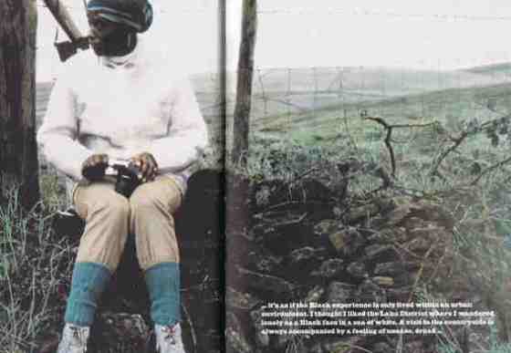
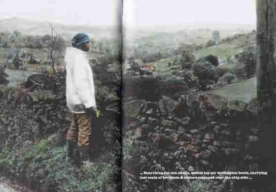
The reasons for this are complex and cannot be addressed here, but this topic has been picked up by repeatedly by oppositional photographers who seek to comment on the way British tourism has excluded certain groups from the history the industry presents.  One such photographer is Ingrid Pollard whose Pastoral Interludes (1987) contrasted historic assumptions about the English landscape with the largely inner-city landscape experienced by most Black Britons.  Rather than the English landscape being the inspiration for poets and artists or the location for ramblers the nation over, Pollard’s reading of the landscape was both disenchanting and threatening.

pollard

…it’s as if the Black experience is only lived within an urban environment. I thought I liked the Lake District where I wandered lonely as a Black face in a sea of white. A visit to the countryside is always accompanied by a feeling of unease, dread….”

pollard-2

…Searching for sea shells, waves lap my Wellington boots, carrying lost souls of brothers & sisters released over the ship side…

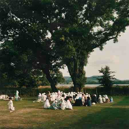
John Kippin also challenged this traditional view of the British landscape, framing activity reflecting contemporary culture within the traditional landscape associated with Britain.  His image Prayer Meeting, Windermere captures Muslims at prayer in the Lake District and is perhaps his most well-known image.

Prayer meeting, Windermere

Prayer meeting, Windermere by John Kippin

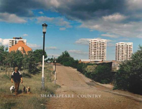
Shakespeare Country, by John Kippin

Shakespeare Country, by John Kippin

Quite whether Chris’s work can be considered oppositional is open to question as it’s certainly never been his intention to debunk the history that is presented at the Tower, his work is more concerned with a relationship with the landscape itself rather than a commentary on the socio-political and economic that framework in which the Tower of London is presented as a visitor experience.  The likes of Jem Southam, Robert Adams and Alec Soth (who I will cover in my next post) are a much greater influence than Parr, Pollard or Kippin.

Fun at the Tower

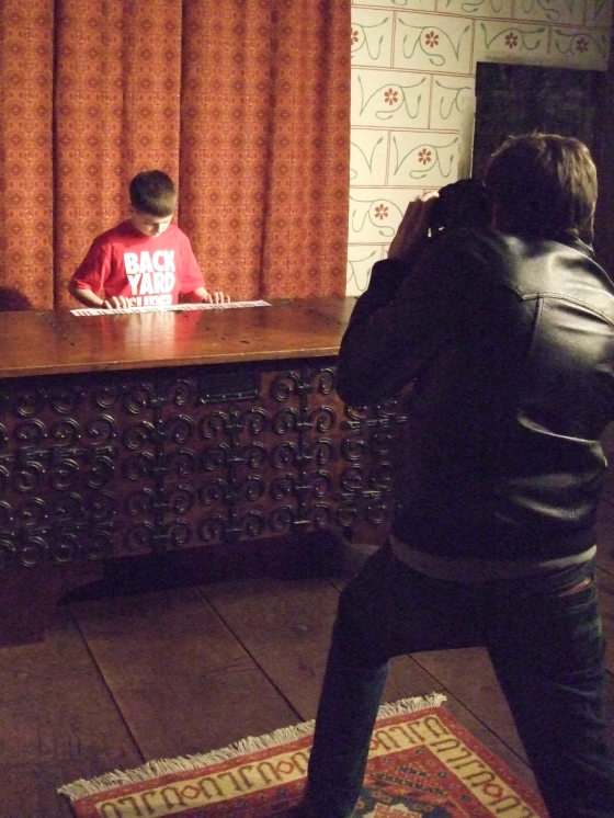
A portraiture project with the Downside Fisher youth club.

At the first session, we discussed portraiture with the group. Showing many examples, we considered the question, How do we read a portrait? Themes raised were; identity, objects and what they represent, how the photo was taken, expression etc… To create their own portrait each young person asked themselves the following questions;

What will you be doing in the photograph?
How do you want others to see you?
How do you see yourself?
At what angle will the photograph be taken?
What will you be wearing?

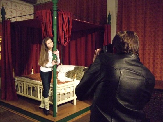
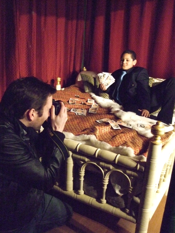
The photographs were taken in the Medieval Palace at the Tower of London. The bedchamber of King Edward I was a fabulous interior for the backdrop of our photo shoot.

Irish tap dancing for the King?

Irish tap dancing for the King?

A performer for the King?

Playing for the King?

dscf19421

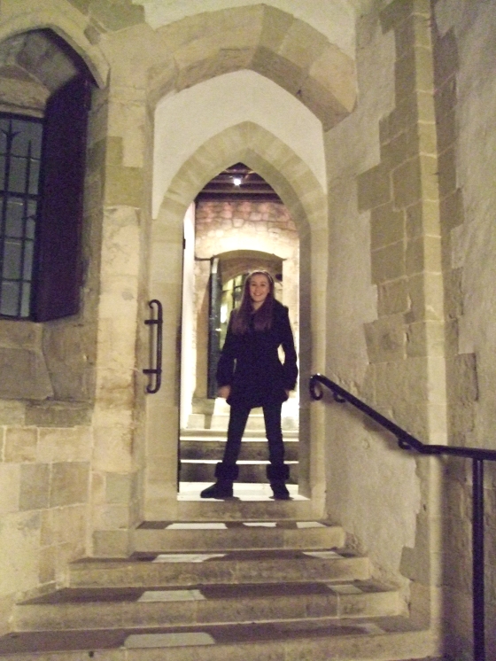
Exploring the hallways of the Medieval Palace

A wealthy visiting King?

A wealthy man visiting the King?

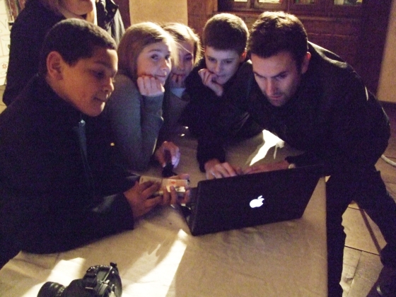
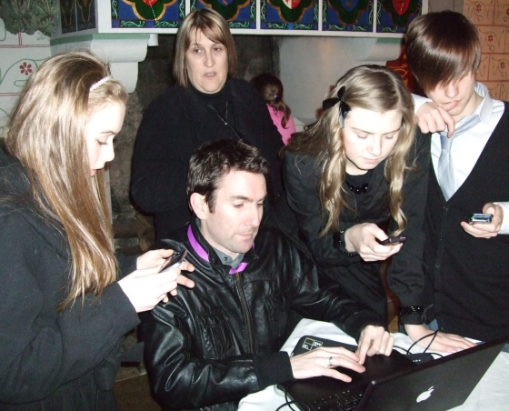
Chris and youth viewing images

Chris and youth viewing their images

Can't wait for the print... so we'll take a photo of the screen with our mobiles

Can't wait for the print... so we'll take a photo of the screen instead

This project was an opportunity for these young people to explore and express their identity. Very quickly we discovered art directors, organisers, models and performers. A rather fitting space for an interior used by medieval kings and queens during their short visit to the Tower.

The final images will be presented in a large format on the exterior of the white tower coinciding with the 500th anniversary of King Henry VIII’s accession to the throne. An enjoyable project had by all.

Killip and the ongoing edit

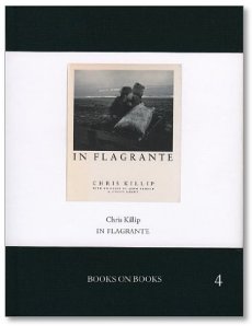
I was interested in Alex’x post about Parr and Killip as this book about Killips ‘In Flagrante’ arrived for me in the post on saturday:

41jnn4ugcl_sx350_bo1138138138_sh30_bo0100100100_pa75510_2

(in the publishers words):

‘The Books on Books series is an on-going publishing project dedicated to making rare and out-of-print photography books accessible once again to photobook enthusiasts. Each in this series presents the entire content, page for page, of an original master bookwork which, up until now, has been too rare or prohibitively expensive for most of us to experience. These are not facsimiles but complete studies of those original masterpieces’

its a lovely thing and highlights what an amazingly powerful piece of work this is – for a photographer like myself ‘In Flagrante’ it so good that its daunting.

Alex also mentioned the final edit for the Tower projects exhibition. So far I have ten images in the capable hands of the printer Robin Bell and today I have been working on editing the final 5 images to complete the show. Once I have these final choices made I will drop the negs off with Robin on thursday – the point of (almost) no return.

In opposition…

Tourism was not the only industry to experience massive growth in the post-war period.  Growth in higher education meant that photography degrees became more widely available and those that graduated from these courses saw photography increasingly as a medium for personal expression.  Naturally, it was a matter only a matter of time before the tourist gaze was subject to the critical eye of the photographer and these photographers would be come to be collectively known as oppositional photographers.

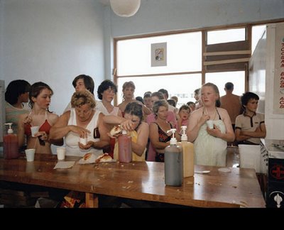
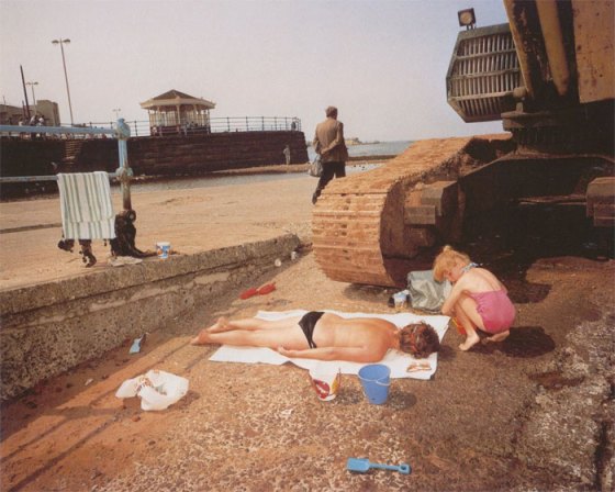
Martin Parr is now almost a household name but back in the 1980s his work was seen as a controversial commentary on Thatcher’s Britain.  Parr’s most noted work of this period can be found in The Last Resort and The Cost of Living in which Parr honed his sardonic gaze as an outsider on the leisure pursuits of both the working and middle classes. The significance of Parr’s work is that he was commenting on tourist behaviour rather than the sites themselves and in doing so offered commentary on British attitudes, manners and habits and often makes for uncomfortable viewing as a result.  So seductive are his images that for many they define their notions of Britishness, but I find that the more I look at them, the more I see the work of an outsider who has captured the tip of the iceberg rather than its bulk floating menacingly just below the surface.

martin_parr_the_last_resort_1145_67

martinparr-newbrighton

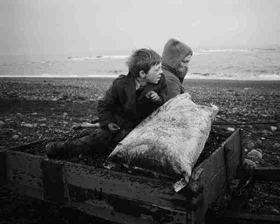
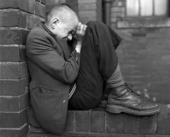
This can be contrasted with Chris Killip whose book In Flagrante documented the impact of 1980s industrial decline on small communities in the north east of England suffering acutely from mass unemployment and poverty and whose lives were slowly but painfully slipping out of their control.  His choice of location is important – Newcastle upon Tyne was one of the birthplaces of industrial Britain with coal, shipbuilding and the railway industry forming the industrial backbone of the nation for over a century.  Killip worked in a traditional documentary fashion, spending large amounts of time living in the communities he photographed and getting to know the people that appear in his images.  If he hadn’t could he really have created such beautiful and haunting images from such devastation and turmoil?  Undoubtedly, Killip’s images would be very different if he had made the same choices as Parr, photographing in colour with flash and visiting only as occasion permitted.

artwork_images_911_363279_chris-killip

hashphoto-010_chris_killip_you_azmlsgsozhb

And that leads us onto Chris King’s work at the Tower.  This residency has allowed Chris to immerse himself in the project for a longer period of time, returning repeatedly to the same locations and talking to the people who inhabit them which, in turn, informs his work.  Although I am yet to see Chris’s final body of work, I know enough of his process and work in progress that it will provide a welcome and fresh insight into the Tower, overlooking spectacle and colour, and reaching for deeper and stronger connections in the landscape and history of the space.

In my next post I’ll look at some of the more oppositional photographers who have been working since the 1980s.

Fact into Metaphor

While browsing the college library the other day I found a book called ‘Isolate’ by an artist/photographer I have never heard of before – Calum Angus Mackay. Its a thin book and the pictures really drew me in, the style of work is very unfashionable at the moment: monochrome, elusive, beautifully subjective and almost hauntingly poetic. I don’t know a great deal about Mackay but from what the book tells me he works as a crofter and makes his photographs in the farm buildings (often freezing his subject matter in ice before making his wonderful pictures). The pictures shown here are the ones I found on the internet, where Mackay is woefully difficult to find. This underlines the beauty of looking through libraries over searching on the internet, you can stumble over rare, overlooked gems.

by Calum Angus Mackay

by Calum Angus Mackay

In the essay by Ray McKenzie that accompanies the photographs in ‘Isolate’ is a lovely line that captures the possibilities of the photograph:

‘So often thought of as a means of duplicating what is objectively and factually there, the real art of photography lies in its power to transform fact into metaphor, material reality into poetic meaning’

All excuses

First of all I want to apologise for my recent lack of blog activity. My excuses are, as usual about time, I seem to be very busy at the moment and time simply seems to fly by and before I know it another week has gone by. But this excuse would be too simple, under closer inspection I realise that I have slipped into a different mode with the residency and I am currently thinking more about the end product and the technical side of getting to the end product. Over the last week or two I have hardly made any new photographs and therefore seem to have little to write about on the blog.

I am now spending more time talking about budgets, costs and places where we can display the finished work, this, I would guess is like the editing of a film or the mixing of an album. Its not as juicy, or as much fun as producing the work but its necessary and important. The worst thing about the presentation part of a project is that its quite dry and technical but it also gives you far to much time and space to see the project as a whole, time to reconsider and, well … worry.

But, the process is under way and the first negatives are in the printers safe hands, and the ball is rolling. This morning, over a cup of coffee I began to ponder the images that will make up the finished ‘product’ of the residency; 15 photographs to sum up almost 8 months of exploration. Will these pictures capture my thoughts and ideas about the Tower? Well that is yet to be seen. One thing I am thinking about is creating a dummy book of the project, the book is the ideal format to show work, and I can incorporate many of the images that will not make it into the exhibition. I plan to use one of the many online photo book manufacturers to produce 2 or 3 dummies, which I hope to have available to veiw at the exhibtion. I’m going to start this once everything to do with the exhibtion is finished ( at the end of march) which means it will no doubt contain photographs that i make near the end of the residency.

a fast approaching deadline

All of a sudden the end of my time at the Tower is not that far off (about 6 weeks away). So I am now deeply involved in editing the final work and planning the prints. I’m also keen to complete some more photographs, especially the portraits. On top of this I also have one more education project to finish with a school near the Tower of London. We have already completed two education projects within the residency and they both went very well. I’m hoping to put some of the pictures from these projects on this blog fairly soon.

Outside of the process of diciding which of the hundreds of photographs will make it in to the selection for the exhibition, my main concerns focus on print size and the printing process.

 The decision is weighed up between making large prints (40″ x 40″)  from hi-resolution negative scans and printed using a professional Light Jet digital printer or having smaller images (16″ x 16″) printed by the excellent Robin Bell on fibre-based silver gelatin paper using traditional darkroom techniques.

I have decided to go for the smaller, traditional prints rather than the larger digital prints. To show you the main reason why would not work on a computer screen, the difference really needs to be seen to be believed. Digital black and white prints are not as good as traditional photographic prints it really is as simply as that.

There is a depth and clarity with a silver gelatin print that cannot be matched by even the best digital printing techniques. I’m sure some people will disagree but I want to state that I’m not saying this as some sort of Luddite stand in the face of the unstoppable tide of new technology but as a opinion based on visual comparison and experience.

When one is photographing a site which is bound up in so much history and tradition I think it is more fitting to use a printing process that also has its own, long history.